

The Haunting Games Book Jacket


View Project Description
Purpose
The Haunting Games: The Ballad of Shadows and Spirits is a fictional horror-comedy parody of The Hunger Games. It reimagines the original story’s competitive survival premise as an absurd supernatural contest involving ghosts and the living. The design targets readers familiar with the original series and fans of dark humor, while establishing its own visual identity across a complete book jacket.
Design Rationale
Distressed typography, a ghostly figure, and an ominous clock establish a dark atmosphere, while a bright yellow smiley-face balloon introduces the story’s comedic twist. A limited palette of black, white, and yellow creates contrast and consistency across the front cover, spine, back cover, and interior flaps. Careful typography and image placement establish a clear hierarchy, while the original synopsis and supporting content extend the fictional world beyond the cover.
Scoop Shoppe Animated Social Media Ad

View Project Description
Purpose
The Scoop Shoppe advertisement promotes online ordering for a fictional artisan ice cream business offering organic, vegan, and lactose-free options. Designed for social media, it targets families, teenagers, and health-conscious adults with a cheerful, welcoming message.
Design Rationale
The advertisement incorporates Scoop Shoppe’s established blue, pink, green, and purple palette to maintain brand consistency. Photographs featuring people of different ages and backgrounds create an inclusive atmosphere, while bold typography and a straightforward layout communicate the message quickly. Subtle animation draws attention to the ordering call to action without distracting from the surrounding content.
Paws & Claws Brand Identity and Business Card


View Project Description
Purpose
The Paws & Claws identity was developed for a fictional veterinary clinic specializing in natural and alternative animal care. The goal was to establish a professional yet approachable brand that appeals to pet owners interested in holistic wellness.
Design Rationale
Customized lettering incorporates a paw and claw into the letters P and C, giving the clinic a distinctive wordmark. A supporting symbol combines a paw print with leaves to reinforce the connection between animals and nature. Green, soft blue, and tan establish a calm, welcoming palette. The business card extends the identity through consistent typography, colors, and a grass-inspired divider that organizes contact information while supporting the natural theme.
Fresh Fare Farms Multi-Channel Ad Campaign


View Project Description
Purpose
The Fresh Fare Farms campaign promotes a fictional meal-kit delivery service focused on fresh, sustainable ingredients. Targeting busy college students and young professionals, the advertisements also highlight a Hunger Action Month promotion connecting new subscriptions with donations to local food banks.
Design Rationale
The campaign combines fresh-food photography, family imagery, and concise messaging to communicate convenience, healthy eating, and community involvement. Consistent colors, typography, rounded shapes, and the slogan “Local. Sustainable. FRESH.” unify the magazine advertisement, vertical digital ad, and social media carousel. Each layout adapts to its format while maintaining a recognizable visual identity.
Piddle Paddle Tours Brochure Design


View Project Description
Purpose
The Piddle Paddle Tours brochure introduces boat rentals and coastal excursions offered by a fictional tourism company. Designed for visitors interested in local attractions and wildlife, it helps potential customers explore available experiences and find essential booking information.
Design Rationale
Turquoise and green reflect the coastal environment, while wildlife and destination photography highlight the experiences offered. White wave-shaped dividers carry the water theme throughout the half-fold brochure and separate information into manageable sections. Clear headings, consistent spacing, and organized contact details support readability. The finished design is presented through both flat layouts and folded mockups to demonstrate its practical use.
Senior Sniffers Sanctuary Poster


View Project Description
Purpose
The Senior Sniffers Sanctuary poster promotes community doggie playdates for a fictional nonprofit supporting senior dogs and their owners. The design encourages participation through a friendly, upbeat message that celebrates older pets.
Design Rationale
A prominent photograph of a senior dog creates an emotional connection, while bright colors, curved typography, and grass imagery establish an inviting outdoor theme. The information is organized to highlight the sanctuary, event details, and registration instructions. A running-dog silhouette adds emphasis to the call to action while reinforcing the playful atmosphere. A realistic wall mockup demonstrates the poster in its intended setting.
Pasta Amore Menu Design

View Project Description
Purpose
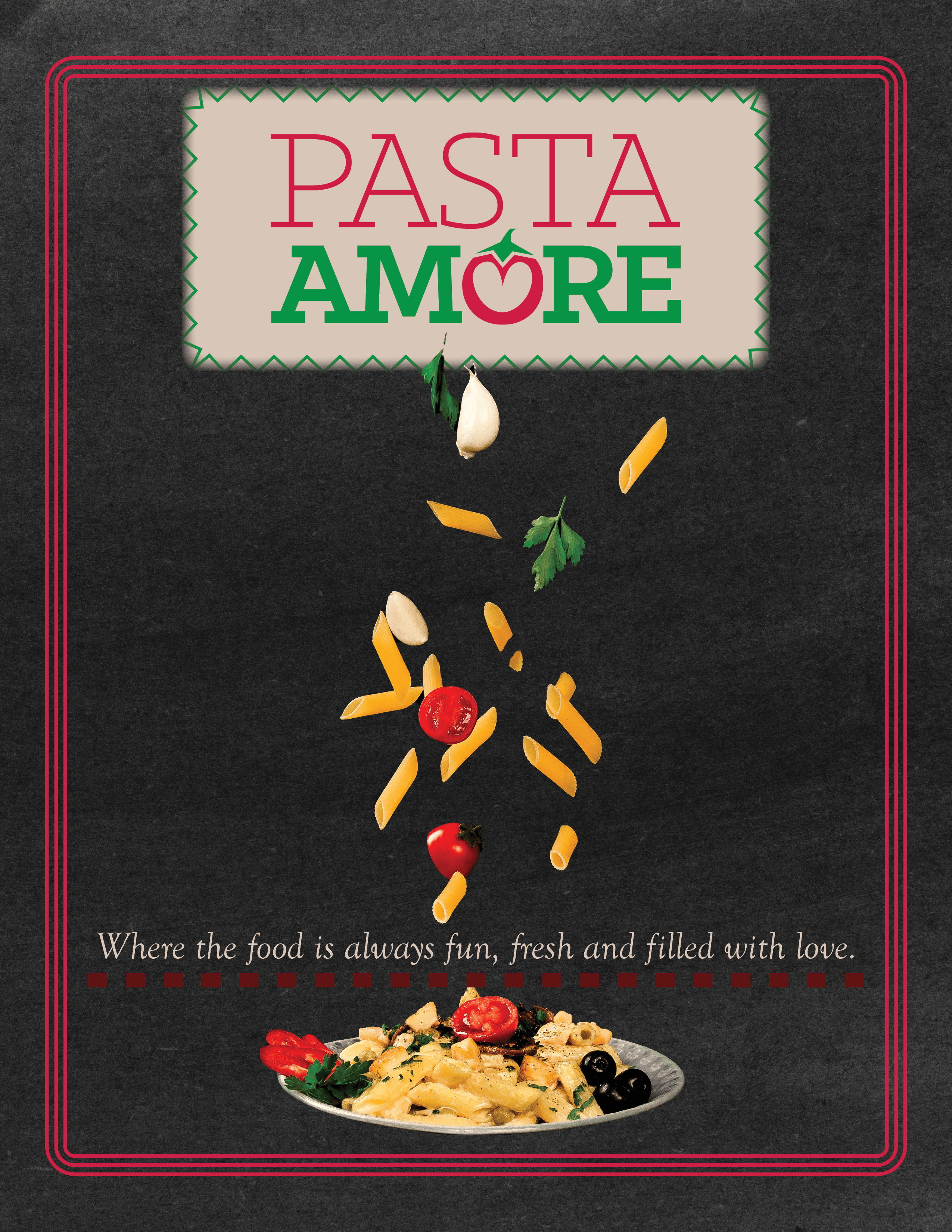
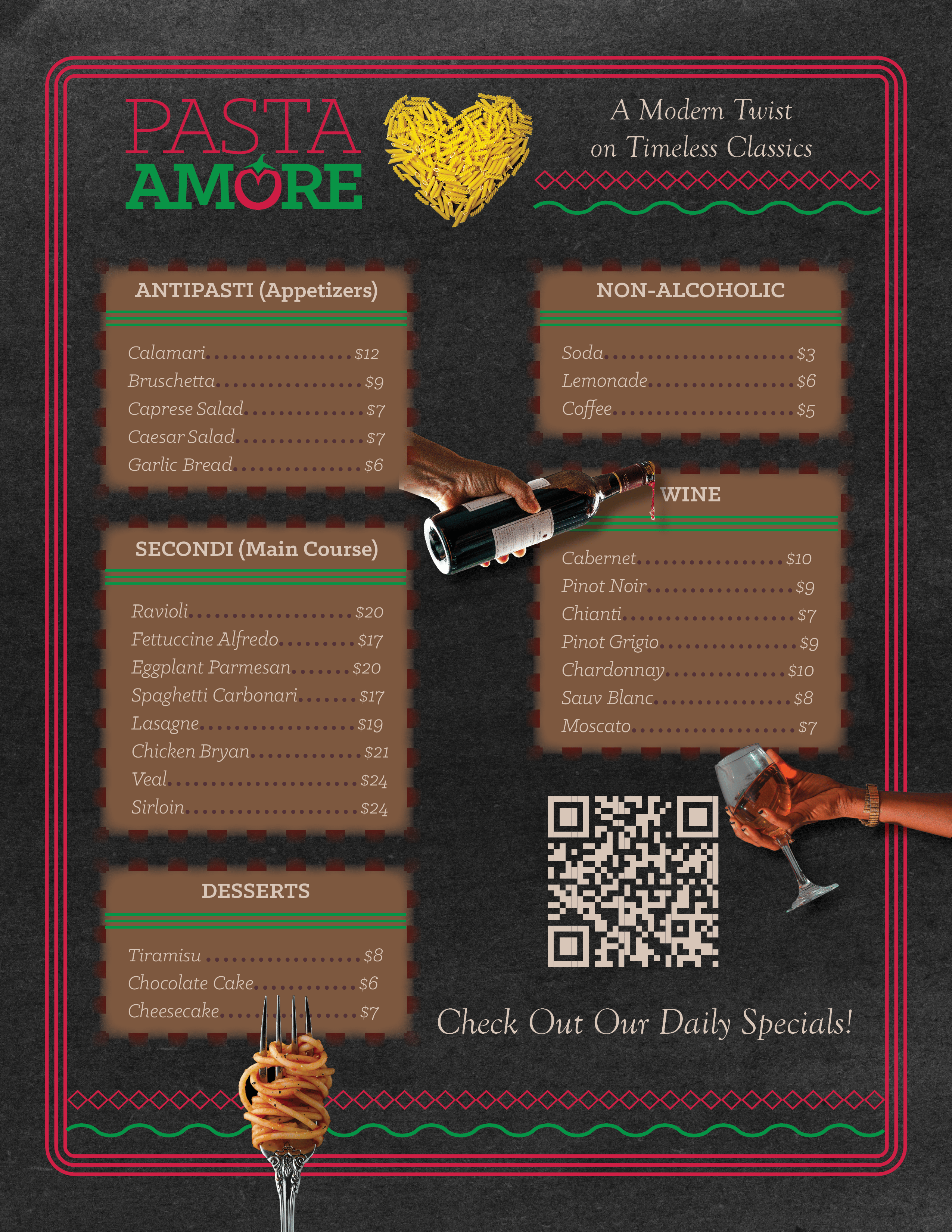
The Pasta Amore menu was designed for a fictional family-owned Italian restaurant offering traditional food in a comfortable, welcoming environment. The goal was to reflect the restaurant’s personality while making food selections and prices easy to navigate.
Design Rationale
Red and green reference Italian heritage, while a chalkboard texture, casual typography, and food photography establish a warm, homemade atmosphere. A pasta-shaped heart reinforces the restaurant’s identity. Clearly separated menu categories, consistent spacing, and aligned prices support readability, while a QR code placeholder allows for digital daily specials without overcrowding the printed menu. Both sides and realistic mockups demonstrate the finished design.
Tech Crowd Data Visualization
View Project Description
Purpose
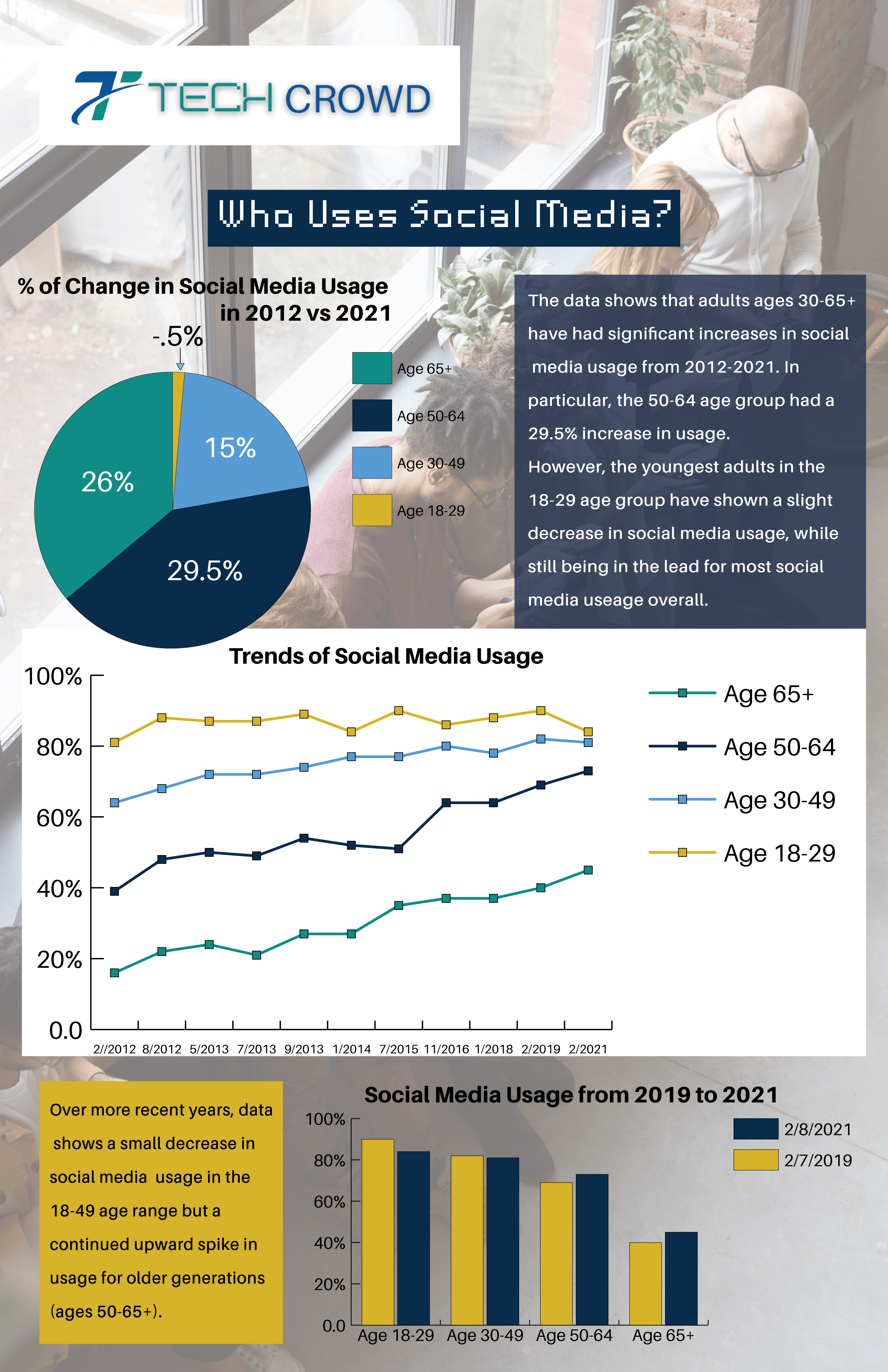
The TechCrowd infographic illustrates changes in social media usage across age groups between 2012 and 2021. Created for a technology-focused audience, it makes statistical comparisons easier to understand while highlighting increased usage among older adults.
Design Rationale
A pie chart summarizes changes across age groups, a line graph illustrates long-term trends, and a bar chart compares usage between 2019 and 2021. Consistent blue, teal, and yellow distinguish the groups throughout the design. A faded photograph of people using cell phones provides context without competing with the data. Contrasting panels, clear chart backgrounds, and brief explanatory text improve readability and emphasize key findings.
BeatsFest Logo Design


View Project Description
Purpose
The BeatsFest logo was developed for a fictional music-streaming service targeting Gen Z listeners, with Millennials as a secondary audience. The identity needed to communicate energy and individuality while remaining recognizable across digital platforms.
Design Rationale
The symbol combines the letters B and F with audio-bar shapes, connecting the brand to music without relying on traditional musical imagery. Bright orange and purple create a contemporary, energetic appearance, while a simpler wordmark balances the distinctive symbol. Consistent colors and a streamlined composition allow the identity to extend into a music-player interface, demonstrated through a realistic phone mockup.
Metromoheim Museum Digital Exhibition Catalog


View Project Description
Purpose
The Metromoheim Museum digital catalog accompanies the fictitious Art Talk: Inclusion and Diversity Through an Art Conversation Exhibition, featuring artists from diverse backgrounds. Designed for museum visitors and art enthusiasts, it presents exhibition information while keeping the featured artwork at the center of the experience.
Design Rationale
The publication incorporates the museum’s supplied logo and exhibition imagery to maintain its established identity. Generous white space emphasizes the artwork, while navy information bands, pink description panels, and yellow accents establish a consistent visual structure. Repeated typography and layout elements make the catalog easy to navigate without diminishing the individuality of each artist’s work. The cover and interior spread demonstrate the design’s continuity.
Dreamwoven by Coley Brand Identity & Merchandise Collection

Mug

Tumbler

Scented Candle

Tote Bag
Journal

Sticker

Ornament

Canvas Print

Youth T-Shirt

Adult T-Shirt

Hoodie

Cropped Tank Top

Crop Top
View Project Description
Purpose
Dreamwoven by Coley is a self-initiated brand identity developed for a creative business offering freelance graphic design, original artwork, and merchandise. The identity reflects a whimsical, unconventional approach to creativity while establishing a recognizable visual system that can extend across digital and physical applications.
Design Rationale
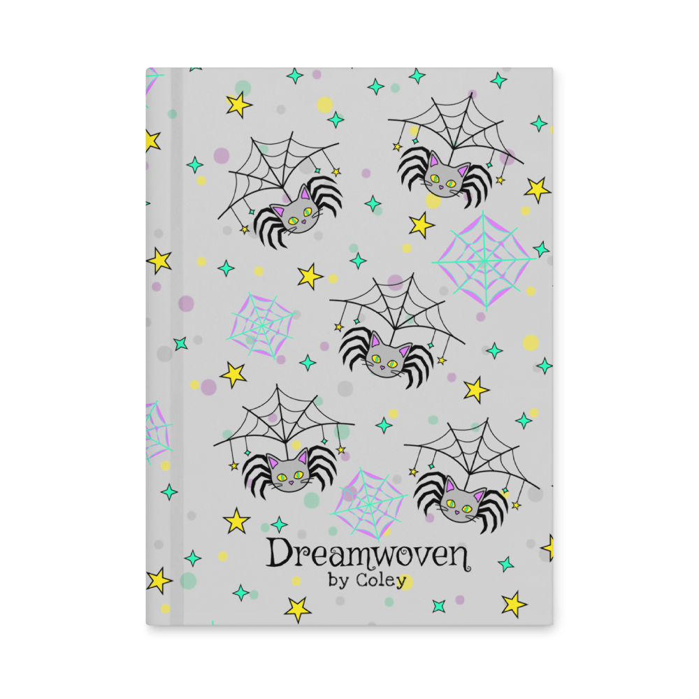
The original Spidercat mascot combines playful and spooky imagery, giving the brand a distinctive personality. Black, gray, and bright accents of Lavender, vivid mint green, and yellow, create a cohesive palette, supported by spiderwebs, stars, and decorative typography.
The identity extends across clothing, accessories, stationery, home goods, and other merchandise through coordinated graphics and product mockups. These applications demonstrate how a consistent visual system can adapt to different formats while maintaining brand recognition. The same elements carry through the business website and promotional materials, connecting its graphic design services and original merchandise under one creative identity.